
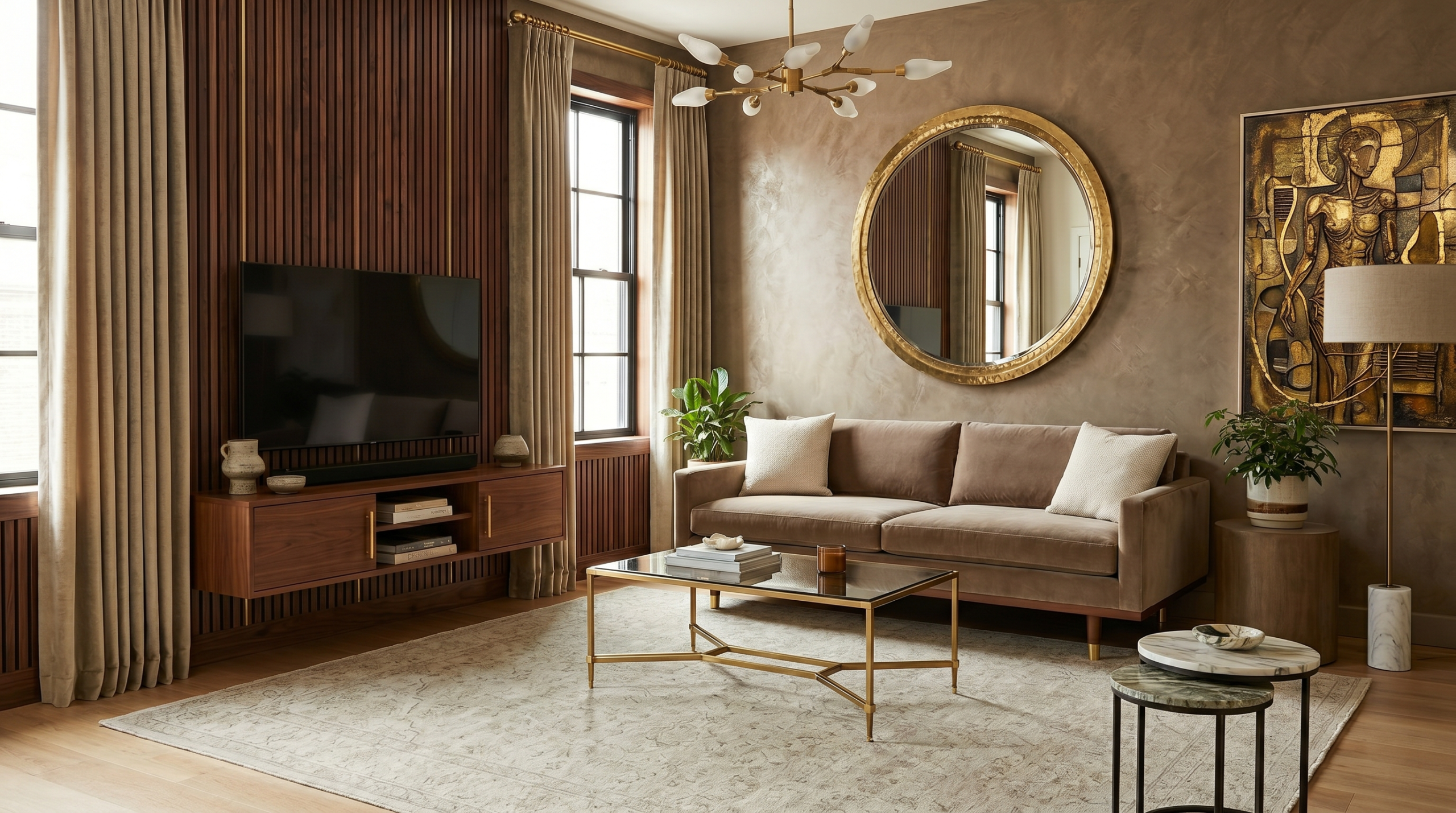
1. The Floating Media Console Shift
We’ve all been there—staring at a small living room floor and feeling like bulky furniture is eating every square inch of open space. You want a media setup, but a standard TV stand blocks the walking path. It feels heavy and limits visual space instantly.
Fortunately, you can fix this by mounting a sleek console directly onto your wall studs. Lifting the entire unit off the ground exposes the floor underneath. This trick fools your brain into thinking the room is much larger than its actual footprint.
Next, pick a finish that matches your wall color to make the piece blend in. Keep the unit shallow, around ten to twelve inches deep. This gives you enough storage for devices without cutting into your actual floor area.
Pro-Tip: Run all your messy device cords through a plastic wall channel before painting the track the exact color of your drywall. This simple trick hides ugly cables completely and creates a clean look. You will get a seamless appearance without paying an expensive electrician to fish wires through the wall.
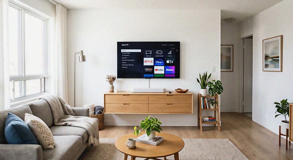
2. The Smart C-Table Alternative
You sit down with a hot cup of coffee, but there’s no spot to set it. A massive coffee table will block the room traffic, yet you still need a functional surface. It is a daily struggle that leaves your space feeling incomplete and awkward.
Instead of a big central table, slide a slim C-shaped end table over the arm of your couch. These clever pieces have a flat base that slips right under the sofa frame. Consequently, the top surface sits perfectly above the cushions right where you need it.
They take up almost zero physical footprint in your room layout. You can easily move them around when guests come over. They offer total convenience without blocking the flow of your walkways.
Pro-Tip: Look for a C-table with a built-in USB charging port hidden underneath the wooden top surface. This allows you to charge your phone right next to your seat without running long cords across the floor. It keeps your seating zone safe from trip hazards and looks highly organized.
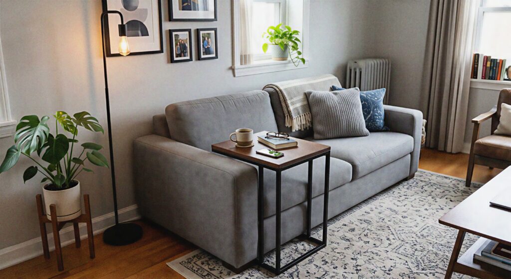
3. Vertical Striped Accent Treatment
Your low ceilings might make your cozy living space feel a bit cramped. You look up and wish the room felt grander and more open. Standard paint jobs just seem to highlight the lack of architectural height.
Therefore, use wide vertical stripes on a single accent wall to guide the eye upward. You do not need loud colors to achieve this effect. Instead, use two slightly different shades of the same neutral tan paint color.
One stripe can have a matte finish, while the alternating stripe uses a soft satin sheen. The subtle shift in texture catches the natural light beautifully. This creates an optical illusion of a much higher ceiling.
Pro-Tip: Use high-quality painter’s tape and seal the edges with a tiny bit of the base wall color before applying the second shade. This professional technique prevents the top paint color from bleeding underneath the tape line. You will get perfectly crisp, sharp lines that look like expensive custom wallpaper.
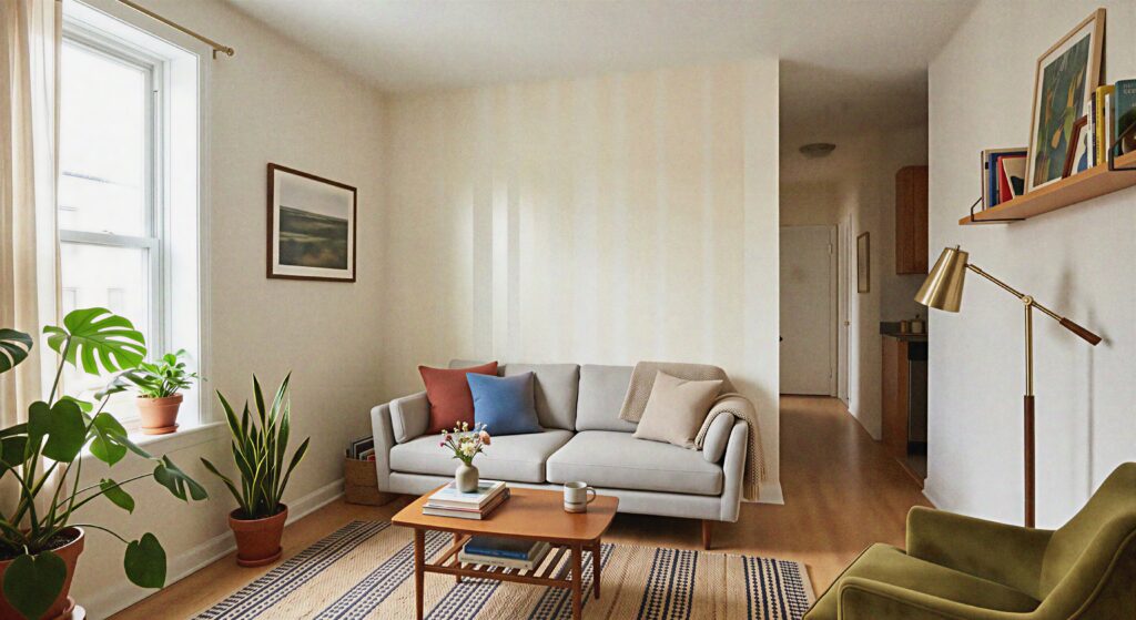
4. Acrylic Transparency Illusion
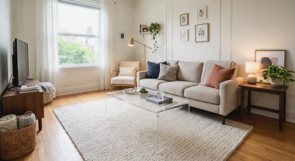
Small rooms quickly feel crowded when you fill them with heavy wood or dark metal pieces. You need a functional coffee table for magazines and books. However, a traditional wood piece acts like a visual roadblock right in the center of the rug.
Clearly, the solution lies in choosing clear acrylic or lucite furniture for your central pieces. A see-through coffee table performs the exact same function as a wooden one. Yet, it visually disappears into the room design.
The eye travels right through the transparent material to see the rug below. This keeps the center of your conversation zone looking completely open and bright. It provides structural function without adding any visual weight to the room.
Pro-Tip: Always clean your acrylic furniture with a soft microfiber cloth and specialized plexiglass cleaner rather than standard window sprays. Ammonia-based cleaners will scratch the delicate surface and create a cloudy film over time. Proper care keeps the material crystal clear for years.
5. High-Mounted Drapery Trick
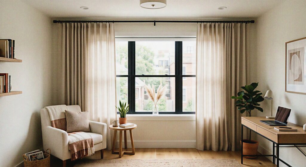
Windows often look small and stunted when you hang curtain rods right above the frame. This common mistake cuts the room in half visually. It limits the amount of natural light and makes the wall feel short.
Fortunately, you can fix this by hanging your drapery rod just two inches below the ceiling line. Extend the rod out about six to ten inches wider than the actual window frame on both sides. This allows the fabric panels to sit on the drywall when open.
Consequently, your window looks twice as large as its actual size. The long vertical fabric lines create a sense of grandeur. This simple shift maximizes the incoming sunlight and alters your perception of the space.
Pro-Tip: Buy curtain panels that are slightly longer than you need, then hem them so they kiss the floor perfectly. Panels that stop a few inches short look unfinished and break the visual height of the room. A tiny bit of iron-on hemming tape makes adjusting the length fast and simple.
6. The Corner Sconce Pivot
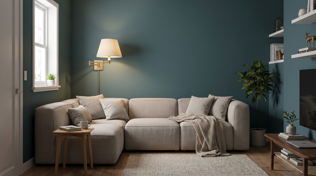
We’ve all been there—trying to read on the sofa but finding the room corners dark and uninviting. You want to add a traditional floor lamp, but the bulky base crowds the end of your couch. It blocks the walkway and limits your layout options instantly.
Instead, mount a pair of swing-arm plug-in sconces directly to the wall behind your seating. This smart choice completely eliminates the need for a bulky lamp base on the floor. Consequently, you free up valuable real estate for foot traffic or a small side table.
The adjustable arms allow you to position the light exactly where you need it for tasks. When you finish reading, simply push the fixture flat against the wall. It keeps the area looking organized and beautifully balanced.
Pro-Tip: Install a matching metal cord cover over the hanging wire to hide the plastic cable completely. This inexpensive addition gives the fixture a premium, hardwired look without the high cost of a professional electrician. It adds a sleek architectural detail that anchors the entire seating corner.
7. Nesting Table Flexibility
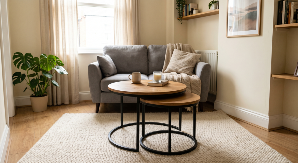
You want to entertain friends, but hosting a crowd in a tight room feels incredibly challenging. A large, static coffee table leaves no room for people to move around safely. However, removing tables completely leaves your guests with nowhere to place their drinks.
Therefore, replace that bulky center table with a set of staggered nesting tables. These pieces stack neatly together into a single compact footprint when you are alone. They look like a deliberate, layered design choice in your daily setup.
When guests arrive, simply slide the smaller tables out and scatter them around the room. This provides every seat with a convenient surface for snacks and drinks. Finally, slide them back together when the party ends to regain your open floor space.
Pro-Tip: Choose a nesting set with mixed materials, such as a wood top for the largest table and metal tops for the smaller ones. This texture contrast adds visual depth to the room without requiring extra decorative items. It creates a rich, curated look that makes the space feel highly custom.
8. Oversized Mirror Reflection
A small room with limited windows can easily start to feel a bit plain and enclosing. You stare at the blank walls and wish the space felt brighter and more connected to the outdoors. Traditional art pieces look nice, but they do not alter the physical perception of the room size.
Fortunately, hanging a massive, floor-length mirror on your primary focal wall changes everything. Position the mirror directly across from your largest window if possible. This placement allows the glass to catch the incoming natural light and bounce it deep into the dark corners.
The reflection creates a beautiful illusion of an entirely new room existing beyond the wall. It instantly doubles the visual depth of your living zone. This makes the entire layout feel breezy, open, and full of life.
Pro-Tip: Secure the top of a heavy floor mirror directly into a wall stud using a heavy-duty safety anchor strap. This prevents any accidental tipping if someone bumps into the frame in a tight walkway. It gives you peace of mind while maintaining a stylish, leaning look.
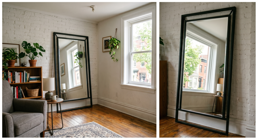
9. Legged Furniture Elevation
Heavy, boxy sofas that sit flat on the floor can make a small room feel very crowded. They act like giant visual blocks that stop the eye from moving through the space. The lower half of the room ends up looking dense, dark, and heavily structured.
Instead, select a sofa and chairs that feature tall, tapered legs. Raising the base of your furniture just six inches off the floor changes the entire feel. It allows light and air to pass underneath the seating pieces seamlessly.
This openness makes the heavy furniture items appear to float within the room layout. The continuous view of the flooring underneath expands the perceived boundaries of the space. Clearly, it creates an airy atmosphere that feels light and balanced.
Pro-Tip: Match the wood tone of your furniture legs to the tone of your hardwood floors to create a seamless transition. This continuity makes the legs blend into the background rather than drawing focus down to the floor. It keeps the visual attention on your beautiful upper decor elements.
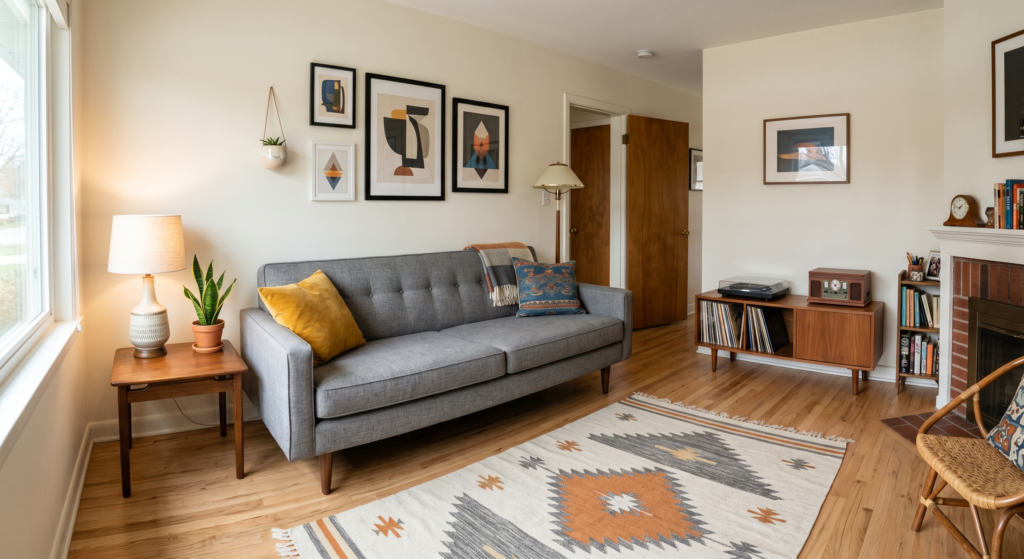
10. Multi-Functional Storage Ottoman
Blankets, board games, and extra pillows frequently end up piled on chairs in smaller homes. You want a tidy space, but a lack of built-in closets makes organization difficult. Buying separate storage cabinets only crowds your limited floor plan even further.
Consequently, replace your traditional coffee table with a large, fabric-upholstered storage ottoman. This single piece serves three distinct design functions simultaneously. It works as a comfortable footrest, an extra bench seat for guests, and a hidden storage bin.
Simply lift the hinged top to tuck away all your unorganized living room items. This keeps your daily necessities close at hand but completely out of sight. It solves your storage needs without adding a single extra piece of furniture.
Pro-Tip: Place a flat wooden serving tray on top of the plush upholstery to create a stable surface for drinks and vases. This prevents cups from tipping over on the soft fabric while maintaining a cozy look. You can easily remove the tray whenever you need extra seating.
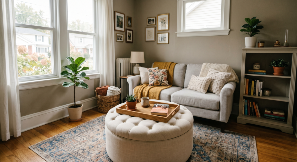
11. Low-Profile Seating Scale
We’ve all been there—walking into a compact living area and feeling like the sofa dominates the entire vertical space. A high-backed couch cuts the room in half visually, making the ceiling feel incredibly low. It blocks the sightlines and creates a heavy, enclosed atmosphere.
Instead, select a sleek, low-profile sofa with a back height that sits below thirty-four inches. Keeping the furniture silhouette low preserves a massive amount of open wall space above the cushions. Consequently, the distance between the top of the couch and the ceiling looks much grander.
This simple shift in scale opens up the entire room and lets the eye travel freely across the walls. The lower seating height feels relaxed, casual, and highly modern. It provides total comfort without overwhelming the architecture of your home.
Pro-Tip: Pair your low-profile sofa with a few thin, oversized lumbar pillows instead of standard square accent cushions. Long lumbar pillows emphasize the horizontal lines of the furniture rather than adding unwanted vertical height. This clever styling trick keeps the look sleek, tidy, and perfectly proportioned for compact rooms.
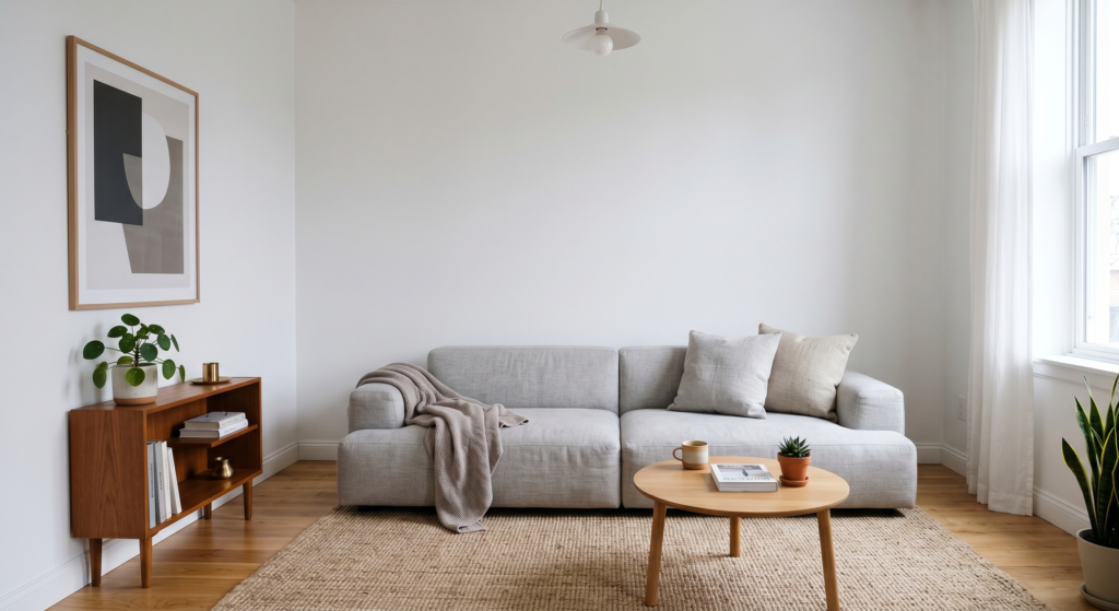
12. Monochromatic Paint Continuity
You want your small room to feel expansive, but breaking the space up with different paint colors yields the opposite result. A dark accent wall against bright white trim creates sharp, noticeable boundaries that highlight the small footprint. It forces the eye to notice exactly where each wall starts and stops.
Fortunately, you can eliminate these harsh visual borders by using a smart monochromatic color scheme. Paint your walls, baseboards, window trim, and doors the exact same soft neutral shade. Use a flat finish on the drywall and a durable satin finish on the woodwork.
Because there is no contrast between the walls and the trim, the structural boundaries simply disappear. The eye glides across the entire perimeter without hitting any jarring visual roadblocks. This creates a continuous, flowing environment that feels peaceful and spacious.
Pro-Tip: Extend this monochromatic paint treatment all the way up and across the ceiling to maximize the open effect. Painting the ceiling the same color as the walls removes the horizontal line where the wall ends. It blurs the edges of the room entirely, making the space feel like a grand architectural gallery.
13. Acrylic Wall-Mounted Bookshelves
Your collection of books and magazines needs a home, but standard freestanding bookcases take up precious floor area. They stand out noticeably in a tight walkway and cast large, dark shadows across the room. The space quickly starts to feel cluttered and heavy with storage units.
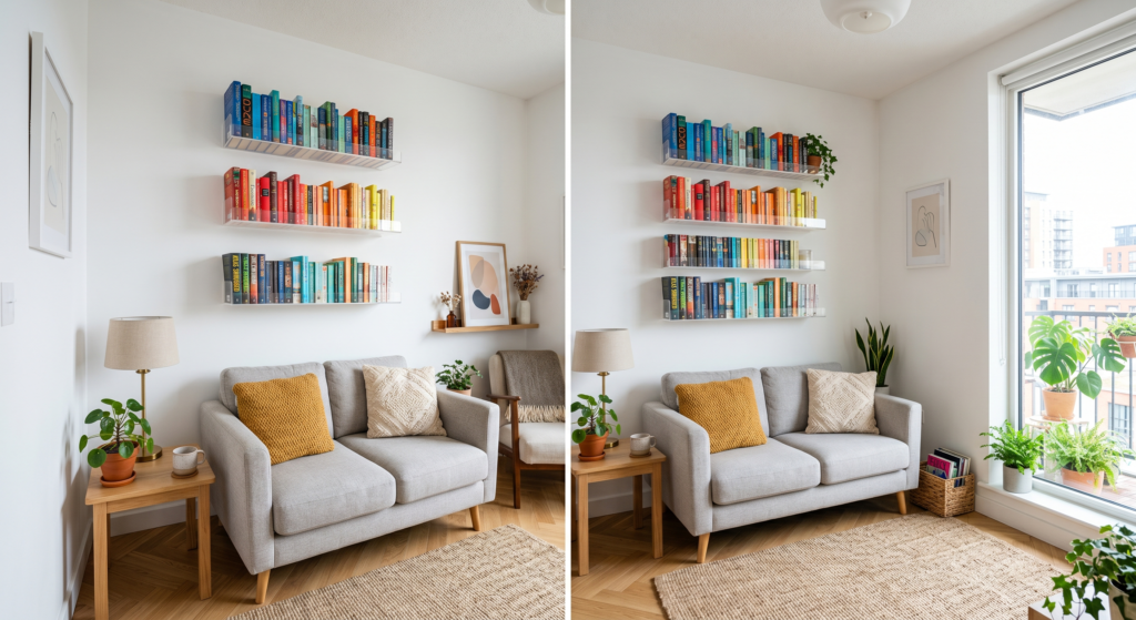
Therefore, mount a series of clear acrylic ledge shelves directly to an unused slice of wall space. These transparent ledges allow you to store your favorite reads vertically using zero floor space. The books look like they are floating magically against the drywall surface.
Instead of a bulky piece of furniture, you get a beautiful, changing display of colorful book covers. The clear material lets the original wall color show through completely. This keeps the wall looking light, open, and artistically organized.
Pro-Tip: Arrange your books by cover color to create a subtle ombre effect that acts as custom wall art. This turns your functional storage solution into a deliberate design statement that adds personality to the space. It keeps the room looking intentional, highly styled, and full of human warmth.
14. Monolithic Light Rug Grounding
A small living room often looks disjointed when filled with several tiny accent rugs scattered around the floor. This layout mistake slices the floor plan into small, choppy segments that feel unorganized and messy. It highlights the limited space rather than creating a cohesive seating zone.
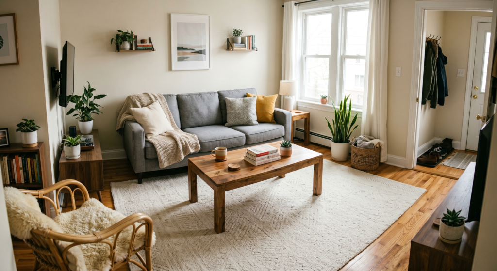
Instead, lay down one massive, light-colored area rug that extends under all your primary furniture pieces. Ensure the rug stops about twelve inches away from the perimeter walls to expose a border of flooring. This creates a single, continuous foundation that unites the entire seating arrangement.
A large, solid cream or soft gray rug instantly expands the floor area visually. It brightens the lower half of the space by reflecting natural light back upward. Consequently, the room feels grounded, stable, and much more expensive.
Pro-Tip: Look for a flat-weave or low-pile rug made from durable synthetic fibers like polypropylene for easy cleaning. Low-pile rugs allow furniture legs and caster wheels to slide across the surface effortlessly without catching. They hold up beautifully to heavy foot traffic while keeping the floor line slim and clean.
15. The Hidden Drop-Leaf Desk
Working from home in a compact apartment means your living room often doubles as a makeshift office. Leaving a traditional wooden computer desk out in the open all day ruins the relaxing vibe of the room. It takes up permanent real estate even when you are off the clock.
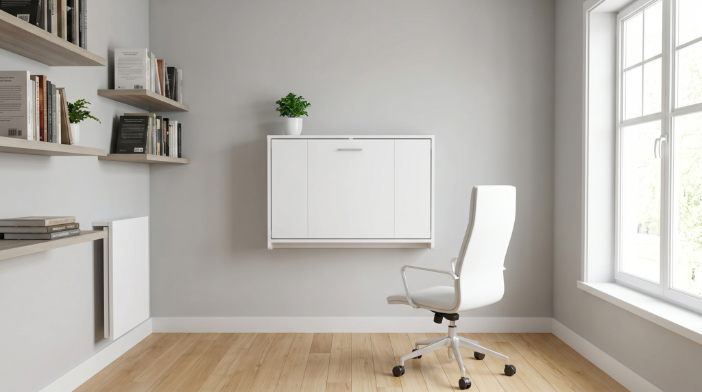
Clearly, the perfect solution is a wall-mounted, drop-leaf desk cabinet that folds flat after hours. When closed, the piece looks like a sleek, shallow storage cabinet hanging on the wall. It takes up absolutely zero floor space and hides your laptop completely.
When it is time to work, simply lower the hinged front panel to create a sturdy desktop surface. This instant workspace provides ample room for writing, typing, and managing daily tasks. Finally, fold it back up when your workday ends to reclaim your living space.
Pro-Tip: Mount a small wireless LED light strip inside the top of the cabinet to illuminate your workspace. This provides focused task lighting for your keyboard without cluttering the desktop with a traditional lamp. It keeps the folding unit self-contained, highly functional, and completely streamlined.
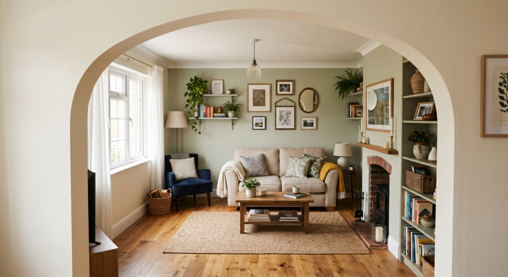
16. The Archway Structural Illusion
We’ve all been there—staring at a standard boxy living room and feeling like the sharp, rigid corners make the space feel restrictive. Box-shaped rooms with flat entryways look highly structured and predictable. They offer no architectural surprise or softness to ease the visual tension.
Instead, create a beautiful architectural shift by installing a curved archway insert into your main room entrance. You can easily modify a standard drywall opening using affordable pre-made arch kits. Consequently, the soft curve replaces the hard angle and draws the eye smoothly upward and over the threshold.
This gentle curve breaks up the boring boxy lines of the room layout instantly. It adds a premium, historic feel to a simple modern home while softening the transition between spaces. Finally, it makes the entry feel like a grand portal rather than a basic doorway.
Pro-Tip: Paint the inner curve of the archway a single shade deeper than your main walls to add dramatic depth. This subtle contrast makes the opening look thicker and more substantial, like a historic masonry wall. It creates a stunning frame for whatever view sits inside the next room.
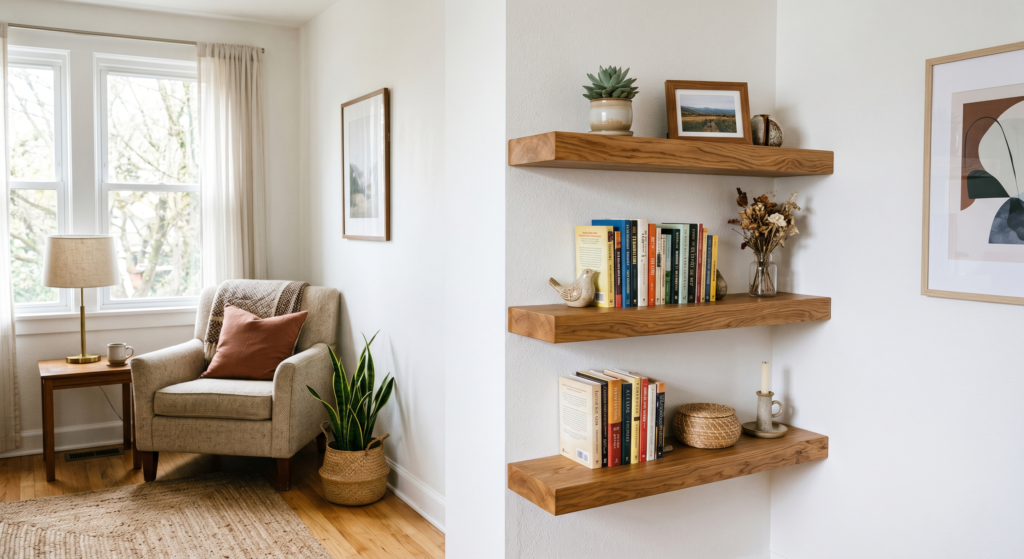
17. Floating Corner Shelf Stacking
You need spots to showcase your favorite plants and small art objects, but accent tables crowd your walking paths. Placing a traditional shelf unit against a main wall cuts down your available floor area dramatically. It forces you to push your seating closer together, creating an awkward conversation zone.
Therefore, claim the unused real estate in your room corners by stacking thick, floating wood shelves vertically. Install three or four thick shelves right into the corner intersection from chest height up to the ceiling. This clever layout utilizes a zone that typically stays completely empty in small homes.
The floating design keeps the area close to the floor totally clear for foot traffic or seating. It draws the eye upward to highlight the full vertical height of the room corner. Clearly, it provides great storage function without sacrificing a single square inch of floor space.
Pro-Tip: Leave a few inches of empty space on each shelf rather than packing them full of decorative items. Giving each object room to breathe prevents the corner from looking heavy, unorganized, or messy. It keeps the display looking like a curated art gallery rather than an accidental storage pile.
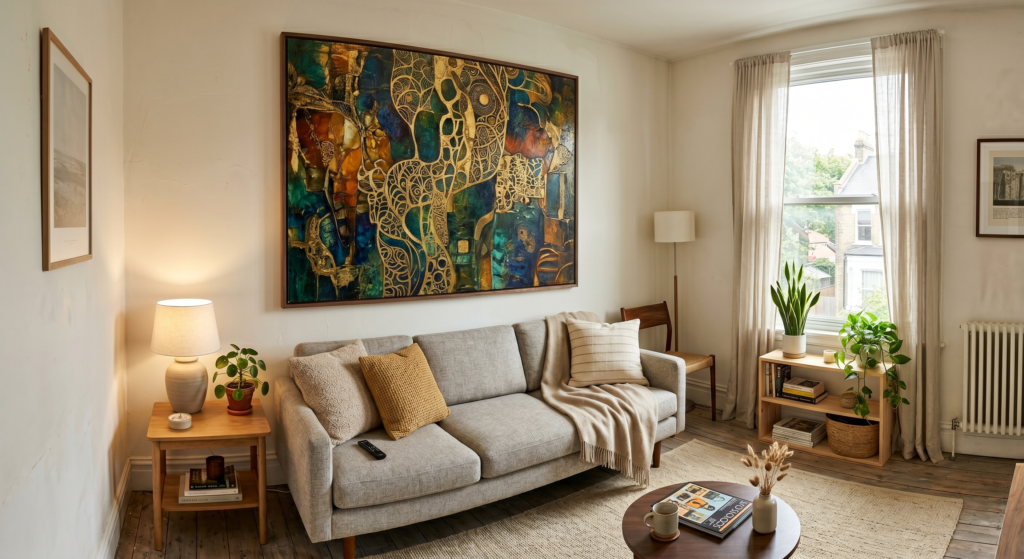
18. Scale-Shifting Oversized Art
A common instinct is to decorate a small wall with a collection of tiny pictures and miniature frames. However, hanging multiple small items creates a choppy look that feels highly unorganized and busy to the eye. It emphasizes the small boundaries of the wall rather than expanding them.
Instead, confidently hang one singular, massive piece of artwork right over your primary sofa arrangement. Choose a piece that covers roughly two-thirds of the wall width to shift the sense of scale completely. A large canvas with an abstract design or a soft landscape works beautifully here.
The giant artwork acts as a singular focal point that simplifies the visual landscape of the room. It commands attention and gives the entire space a bold, expensive, and designer-led atmosphere. It makes the wall feel wide and grand rather than restricted.
Pro-Tip: Select art that features a lot of negative white space or soft, pale sky tones in the composition. This open visual field acts like a faux window, tricking the brain into sensing open air through the canvas. It provides a peaceful resting place for the eyes within a compact layout.
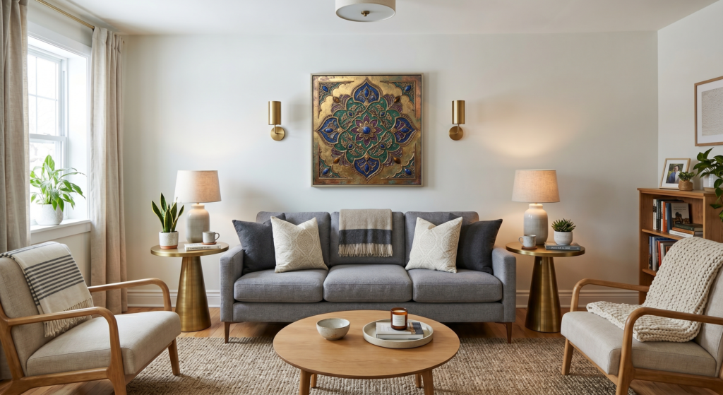
19. Symmetrical Layout Balance
Walking into an oddly arranged room can leave you feeling slightly unsettled, even if you can’t pinpoint why. When a space lacks a clear centerline, furniture placement feels random and visually chaotic. It highlights the challenging nature of a tight floor plan and makes relaxation difficult.
Fortunately, you can introduce instant order by designing a perfectly symmetrical furniture layout along your main wall. Place your sofa dead center, then flank it with identical side tables and matching wall art. This balanced arrangement creates a sense of structural harmony that instantly puts the mind at ease.
Symmetry forces the eye to track through the space in a predictable, orderly pattern. It makes a tight room feel intentional, stable, and highly organized. Consequently, the compact footprint feels like a cozy, high-end boutique hotel suite rather than a cramped apartment.
Pro-Tip: Use a literal tape measure to ensure your flanking pieces sit exactly the same distance from the couch frame. Even a tiny mismatch of two inches can disrupt the visual balance and make the setup look skewed. Precision is the secret key to making affordable furniture look custom-tailored.
20. Backless Daybed Central Divide
You have a long, narrow living space and you want to create two distinct functional zones for seating and dining. However, putting a traditional high-backed sofa in the middle of the room blocks the view entirely. It acts like a giant wall that cuts off natural light and limits visual space.
Instead, use a chic, low-profile backless daybed as your central dividing element. A daybed provides comfortable seating for both sides of the room without blocking the line of sight. The open design allows light and conversations to flow across the entire length of the space.
This flexible piece serves as a beautiful design bridge between your functional zones. Guests can sit facing the media setup or turn around to talk to people at the dining table. It maximizes your seating options while keeping the floor plan completely open.
Pro-Tip: Place a long, narrow runner rug directly underneath the daybed to anchor its position in the room center. This visual boundary helps define the walkway paths on either side of the open furniture piece. It ensures the layout looks deliberate and beautifully structured rather than floating aimlessly.
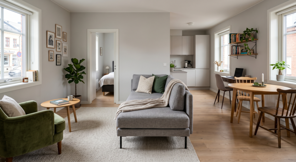
21. The Semi-Flush Mount Light Swap
We’ve all been there—walking into a cozy apartment and feeling like the heavy, low-hanging chandelier is about to bump your head. A fixture that hangs too low cuts into the active walking zone of your room layout. It draws the eyes down and makes the entire ceiling feel incredibly low and heavy.
Fortunately, you can swap that hanging hazard for a beautiful, modern semi-flush mount light fixture. These clever designs sit close to the ceiling drywall while still offering gorgeous architectural details. Consequently, you regain all that valuable vertical airspace above your coffee table setup.
The light casts outward across the ceiling surface rather than focusing in one dark downward pool. This illuminates the upper boundaries of the room, making the whole environment look bright and open. It provides excellent ambient lighting while keeping your physical sightlines completely clear.
Pro-Tip: Select a fixture with multiple adjustable light heads that you can angle toward different dark corners. Directing beams of light toward the walls stretches the perceived width of the room at night. It eliminates dark shadows that typically make a compact floor plan feel small and enclosed.
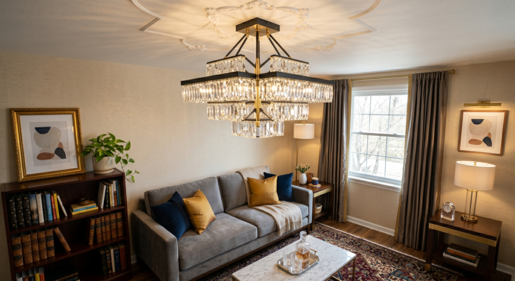
22. Linear Vertical Wall Slatting
Your flat drywall surfaces can sometimes feel a bit plain, flat, and lacking in architectural character. You want to add depth, but bulky decorative items cut into the narrow walking paths next to your seating. It feels like you have to choose between stylish decor and comfortable movement.
Instead, install a section of thin, vertical wood slats directly onto a single focal wall area. Space the slender wood strips about half an inch apart, running them from the baseboard straight up to the ceiling. This textured treatment adds immense warmth without taking up any actual floor space.
The continuous vertical lines guide the human eye on a smooth journey from floor to ceiling. This motion alters your perception of the room height, making the wall feel elongated and grand. Finally, the natural wood texture introduces a premium, designer-led atmosphere to the entire space.
Pro-Tip: Paint the drywall surface a rich matte black before nailing the light oak wood slats on top. This color contrast creates a beautiful 3D shadow effect between the strips that makes the wall look deceptively deep. It adds high-end architectural dimension while keeping the surface flat and clean.
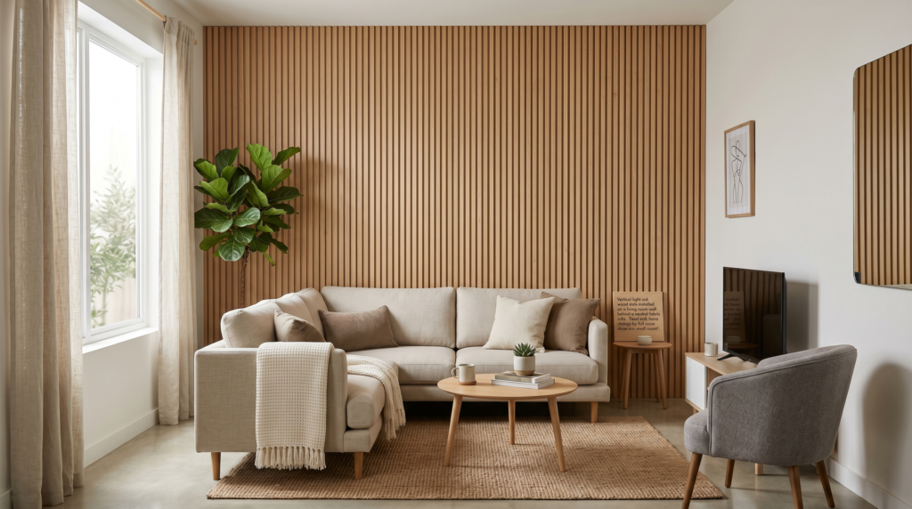
23. The Open-Framed Armchair Selection
A pair of stuffed, overstuffed armchairs can easily overwhelm a small conversation zone. They block the natural path of light and look like massive boulders dropped into a tight layout. The lower portion of your room ends up looking dense, dark, and crowded.
Therefore, replace heavy, fully upholstered seating with slim, open-framed accent chairs. Look for pieces crafted with beautiful wooden or metal arms and exposed structural legs. These designs provide the exact same seating comfort while utilizing a fraction of the visual mass.
Because the back and sides are open, you can see right through the furniture frame to the floor and walls. This transparency allows natural light to circulate freely throughout the layout. Clearly, it keeps your seating arrangement looking breezy, light, and perfectly balanced.
Pro-Tip: Toss a loosely woven, light-colored throw blanket over the back of an open chair to add softness. This adds cozy human texture to the wood or metal frame without blocking the open space underneath the seat. It keeps the furniture piece looking inviting, layered, and highly stylish.
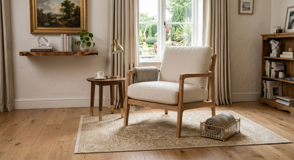
24. High-Shelf Perimeter Wrapping
Finding a home for storage boxes and decorative items in a small space can feel highly challenging. You want to display your treasures, but adding more furniture cabinets limits your physical walking space. The room quickly starts to feel tight, structured, and unorganized.
Instead, install a single continuous display shelf around the entire perimeter of the room, about fourteen inches below the ceiling. This high-level placement utilizes a zone of the wall that always stays completely empty. Consequently, your floor area remains completely open for comfortable furniture placements.
Placing your items up high coaxes the eye to look upward and take in the full scale of the room. It acts like a beautiful architectural crown molding that offers massive storage function. It turns your daily necessities into a stunning, wrapper-around design feature.
Pro-Tip: Paint the long perimeter shelf the exact same paint color as the wall it sits against. This makes the shelf blend into the background structure rather than creating a heavy horizontal line. It allows your books and decorative items to take center stage beautifully.
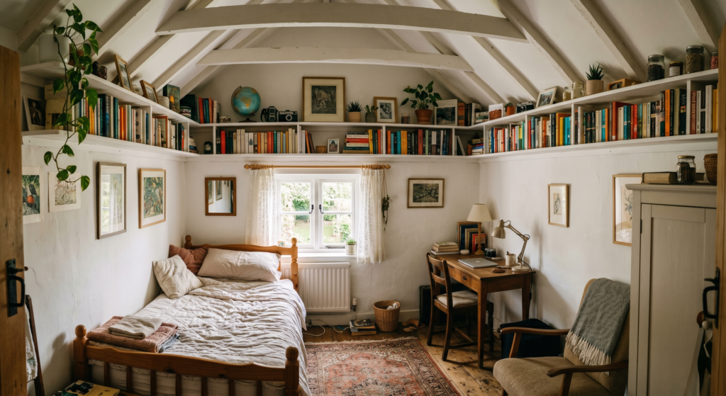
25. Pocket Door Transition Change
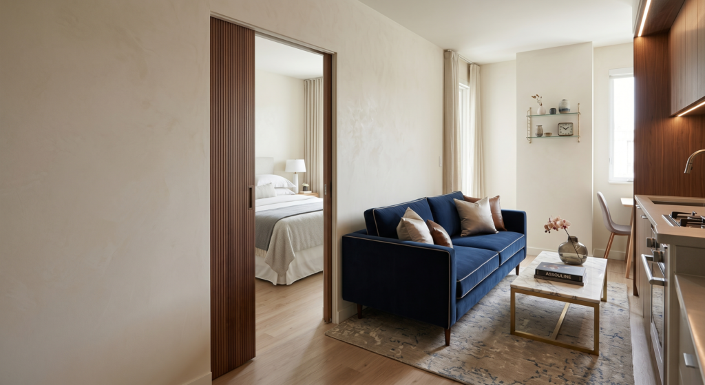
Traditional swinging doors require a massive amount of open floor space just to open and close properly. You find yourself adjusting your furniture layout constantly just to clear the door arc. It leaves you with dead zones in your room corners that you cannot actually use.
Clearly, the ultimate design solution is to replace a standard door with a sleek, sliding pocket door. A pocket door slides smoothly into the interior cavity of your drywall when opened. This choice completely eliminates the swinging arc and reclaims several square feet of usable floor area.
Now, you can place an armchair or a side table directly next to the doorway without any interference. The transition between your living room and adjacent spaces feels smooth, seamless, and modern. It maximizes your functional floor plan while improving the daily flow of your home.
Pro-Tip: Choose a pocket door with frosted glass panels instead of a solid wooden slab. The frosted glass maintains absolute privacy between rooms while allowing soft natural light to pass through the door frame. It brightens a dark interior room layout effortlessly.
26. The Embedded Wall Niche Creation
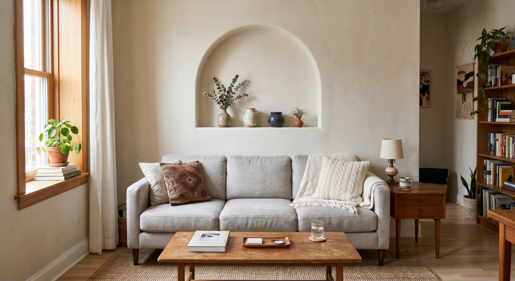
We’ve all been there—bumping against a protruding wall shelf every time you walk past the sofa. You want to display family photos or candles, but standard shelves stick out into your tight walkways. It feels like your walls are actively fighting your physical movement.
Fortunately, you can claim storage space inside your walls by cutting between the vertical wood studs to create an embedded niche. This structural shift creates a recessed display box that sits flush with your drywall. Consequently, you gain functional surface area without taking up a single millimeter of room space.
This architectural detail gives your room a custom, high-end feel inspired by modern European homes. You can finish the interior of the niche with a smooth coat of drywall compound for a clean appearance. Finally, it provides a safe, cozy home for your delicate items completely out of harm’s way.
Pro-Tip: Install a battery-powered, motion-activated LED puck light into the hidden upper lip of the recessed niche. This simple addition washes your displayed items in a warm glow whenever you walk into the room. It creates a stunning focal point at night without the need for complex electrical wiring.
27. Dual-Purpose Console Desk Positioning
You need a dedicated spot to answer emails, but squeezing a full office setup into your living area limits open space. A traditional desk sticks out awkwardly and reminds you of work when you are trying to unwind. The room layout ends up feeling split, unorganized, and cluttered with electronics.
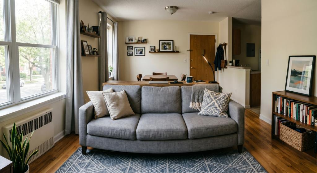
Instead, place a long, slender console table directly behind the back of your primary sofa arrangement. Choose a piece that sits exactly level with the top of the couch cushions to keep sightlines clear. This single furniture choice operates beautifully as a decorative surface during the day.
When it is time to work, simply pull up a sleek stool and slide your laptop out. The table surface acts as a spacious desk that utilizes the dead space behind your seating. This smart layout blending keeps your work life contained without sacrificing your living room comfort.
Pro-Tip: Select a console table that features a built-in metal bar at the bottom to rest your feet while working. This ergonomics detail provides great back support during long typing sessions, making the slim table highly comfortable. When you finish, the stool can slide completely underneath the table frame to stay out of the walkway.
28. Vertical Board and Batten Depth
Flat, plain drywall can make a compact living space feel somewhat cold and lacking in structural design interest. You want to elevate the style of your room, but heavy wallpaper patterns can make the walls feel like they are closing in on you. It is challenging to find the right balance between character and openness.
Therefore, install a simple vertical board and batten trim treatment across your entire focal wall space. Space the thin, flat wooden strips about twelve to sixteen inches apart from each other. Run them from the top of the baseboard straight up to meet the ceiling line.
This architectural woodwork introduces clean horizontal shadows and beautiful linear structure across the surface. The repeating vertical lines pull the eye upward, tricking the mind into sensing immense wall height. Clearly, it gives your home a rich, custom appearance while keeping the design clean and open.
Pro-Tip: Paint the entire wall, including the new wooden trim pieces, in a soft eggshell or satin finish. The slight sheen catches the natural light on the edges of the boards, creating a soft 3D effect that shifts throughout the day. It adds architectural substance to a basic room without spending a fortune.
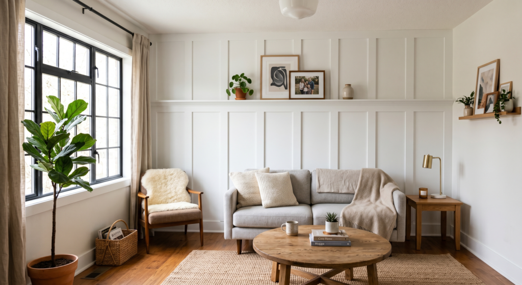
29. Translucent Linen Curtain Filtering
Heavy velvet or thick blackout drapes can quickly suffocate a small living room by blocking out light. They create large, dark vertical blocks of fabric that make the window zone look incredibly heavy and small. The entire atmosphere ends up feeling dark, enclosed, and visually restricted.
Instead, hang breezy, translucent linen curtain panels that allow natural sunlight to filter into the room beautifully. Light-colored linen fabrics soften the harsh glass lines while keeping your privacy intact from the outside world. They catch the breeze and sway gently, introducing a relaxed human movement into the layout.
Allowing natural light to flood the floor plan is the fastest way to make a space feel expansive. The soft texture of the woven linen adds a premium, casual elegance to your windows. Consequently, the room feels bright, open, and deeply connected to the natural world outside.
Pro-Tip: Look for linen-blend curtain panels that include a small percentage of synthetic polyester fibers. Pure linen wrinkles easily and requires constant steam ironing to look presentable in a tidy living room. A synthetic blend gives you that beautiful raw texture while maintaining a crisp, wrinkle-free appearance.
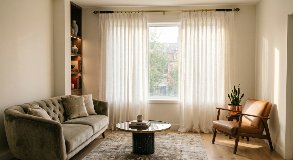
30. Elevated Floating Bookshelf Units
Freestanding bookshelves with thick wood bases often sit heavily on your rugs, cutting into your floor area. They block your peripheral vision as you walk through the room, making the floor plan feel restricted. The space starts to look like a storage warehouse rather than a relaxing retreat.
Clearly, the perfect design alternative is to mount a series of floating box shelves high up on the wall surface. Position the lowest shelf unit at least forty-eight inches above the finished floor line. This placement keeps the entire lower section of the wall completely open and free of furniture clutter.
You can arrange your books, small trailing plants, and art objects inside the floating squares. This keeps your personal treasures beautifully organized while leaving the floor space available for a comfortable chair. It shifts the weight of your storage upward to open up the room layout.
Pro-Tip: Place a trailing pothos or ivy plant on the very top floating box shelf. As the green vines grow and cascade down the side of the unit, they create a beautiful natural vertical line that softens the hard corners of the shelves. It brings life and energy into a small apartment corner.
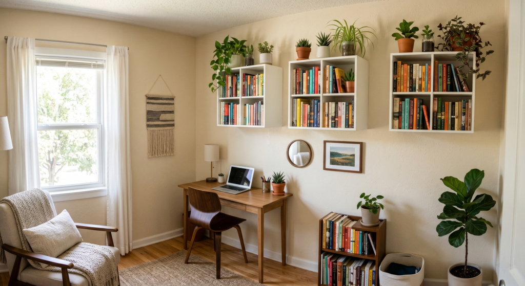
31. The Recessed Curtain Track Integration
We’ve all been there—staring at a bulky metal curtain rod that cuts across the top of your window frame and limits visual space. Traditional drapery hardware stands out noticeably, creating a harsh horizontal line that lowers the ceiling. It breaks up the wall flow and makes a small room feel very structured.
Fortunately, you can eliminate this visual roadblock by installing a recessed ceiling curtain track. Mounting the slim track flush into a shallow ceiling channel hides the entire operating mechanism from view. Consequently, your curtain panels appear to emerge directly out of the ceiling surface like a high-end hotel setup.
This seamless integration creates an unbroken vertical line that stretches the entire height of your room layout. The fabric panels flow downward smoothly without any hardware distractions to interrupt the view. Finally, it gives your window zone a clean, architectural finish that expands the space effortlessly.
Pro-Tip: Use a specialized drapery tape on your fabric panels to create crisp, uniform ripple-fold pleats that hold their shape. Ripple-fold curtains glide along the ceiling track in perfect S-curves, keeping the fabric close to the drywall. This prevents bulky bunches of material from sticking out into your narrow walking paths.
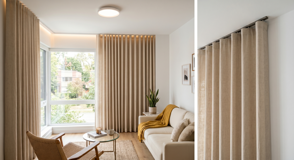
32. The Low-Profile Armless Sofa Shift
Squeezing a traditional rolled-arm sofa into a narrow room can make the entire seating zone feel heavily restricted. Massive, padded arms consume up to two feet of horizontal space without offering any actual seating area. They crowd your walkways and force you to choose smaller, less comfortable accent furniture.
Instead, select a sleek, low-profile sofa with an armless design or ultra-slim track arms. This clever shift maximizes your usable cushion space while reducing the physical footprint of the couch frame. Consequently, you get a spacious seating area that fits perfectly within a tight apartment floor plan.
The lack of bulky arms opens up the sides of the furniture piece completely. This allows the eye to glide right past the couch to notice the open floor space beyond. Clearly, it keeps your primary conversation zone looking streamlined, light, and perfectly balanced.
Pro-Tip: Place a slim wooden sofa sleeve tray directly over the center cushion when you need a spot for drinks. This removable accessory provides a sturdy surface for coffee cups without requiring a freestanding side table. You can easily slide it off when extra guests need to sit down on the couch.
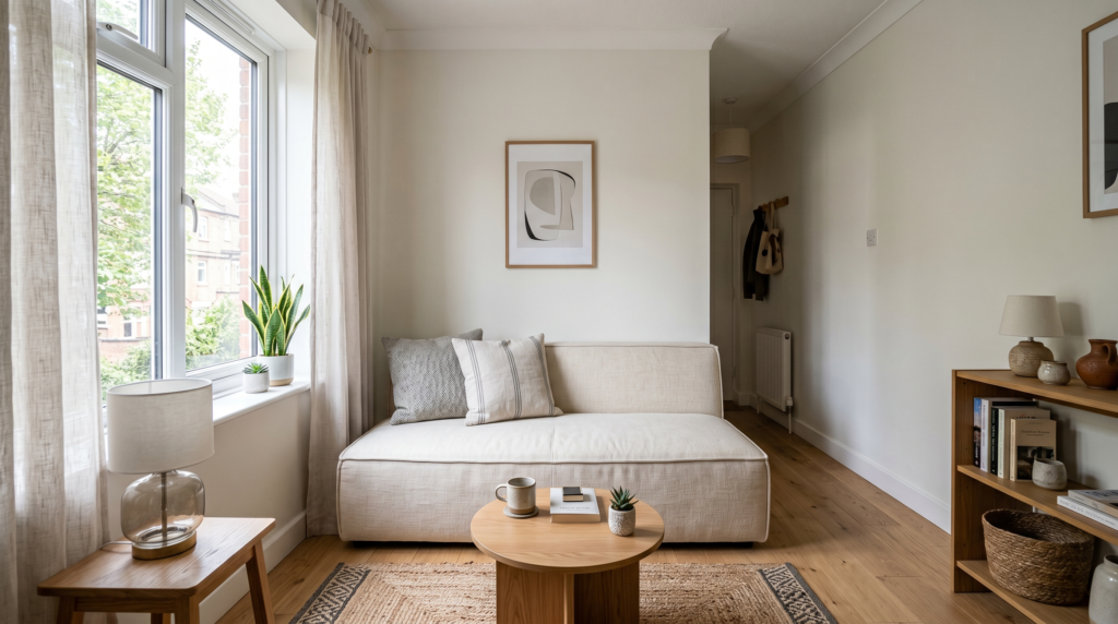
33. Monochromatic Textural Layering
A small living room painted in a single pale color can sometimes feel a bit plain, cold, and incomplete. You want to keep the space bright, but avoiding color contrast can leave the design looking flat and uninviting. It is challenging to create a cozy environment without adding busy patterns that limit visual space.
Therefore, use monochromatic textural layering to introduce deep visual interest without changing your paint color. Mix a variety of rich materials like chunky wool, woven rattan, brushed brass, and matte ceramics within the same color family. For example, pair a cream boucle chair with a soft linen pillow and a smooth stone tray.
Because the colors stay identical, the room maintains its expansive, boundary-free atmosphere. However, the shifting surfaces catch the natural light differently to create soft shadows and rich dimension. This creates a deeply curated, human look that feels incredibly warm, sophisticated, and comfortable.
Pro-Tip: Incorporate a textured plaster or a subtle grasscloth wallcovering in the exact shade of your paint onto your main wall. This adds a beautiful tactile quality to the drywall surface that replaces the need for extra decorative items. It creates high-end designer depth while keeping the room layout completely open.
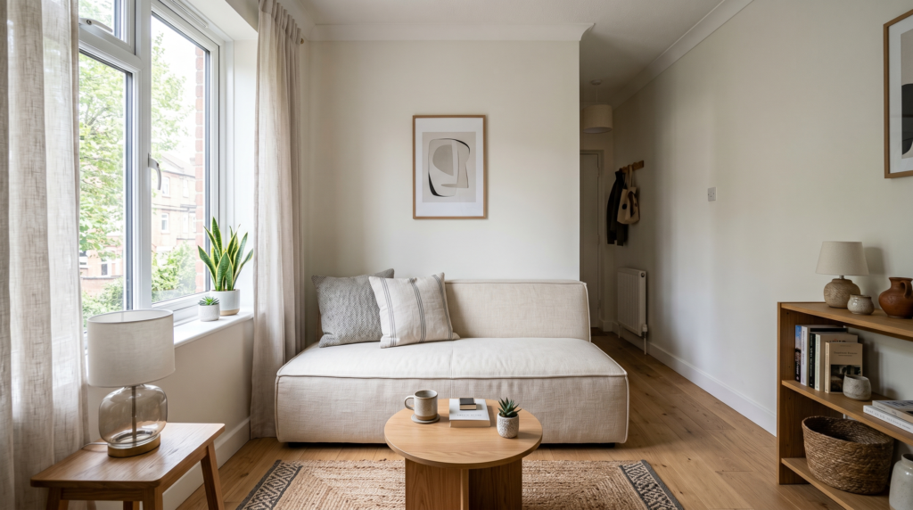
34. The Floating Desk Floating Shelf Hybrid
Working from home means you need a functional desk, but standard office furniture cuts into your active living space. A heavy wooden desk with drawers acts like a giant visual block against your primary walls. The room quickly starts to look like a cluttered workplace rather than a relaxing retreat.
Instead, install a combination floating desk and shelf unit that secures directly into your wall studs. Use a thick, deep wooden plank at chair height for your laptop workspace, then mount narrower shelves above it for storage. This open-bottom design keeps the entire floor area underneath the desk completely clear.
You can easily slide a small office chair or an accent stool all the way under the workspace when off the clock. This integration prevents the desk setup from blocking your physical walkways during your evening hours. Finally, it turns your workspace into a sleek architectural feature that blends into the background.
Pro-Tip: Use a wireless bluetooth keyboard and mouse, then store them flat inside a shallow felt tech tray under the laptop. This simple organization habit keeps your main desk surface completely clean and tidy when you finish your workday. It allows the wooden plank to function as a beautiful display shelf during the weekends.
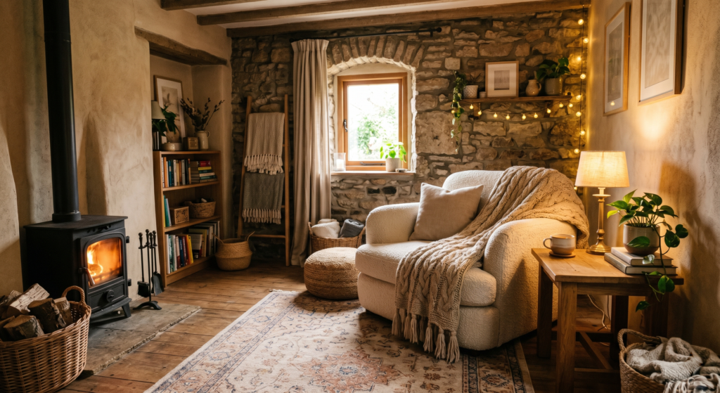
35. High-Mounted Mirror Focal Placement
Dark corners and limited windows can leave a small room feeling a bit enclosing, plain, and needs balance. You hang standard framed prints, but they do not help distribute the limited natural light entering through your single window. The upper half of the walls remains cast in shadow, making the room feel restrictive.
Clearly, the ultimate solution is to mount a horizontal, oversized mirror high up on your primary accent wall. Position the mirror so its top edge sits about twelve inches below the ceiling line, angling slightly downward if possible. This specific placement allows the glass to capture light from the upper portion of the room.
The mirror acts like a beautiful faux transom window, reflecting the ceiling plane and bouncing light deep into the space. It opens up the top half of the room layout, creating an illusion of extra vertical volume. Consequently, your entire living environment feels bright, airy, and beautifully balanced.
Pro-Tip: Choose a mirror frame with a thin, metallic finish like brushed gold or silver to maximize the light reflection. Avoid thick, dark wood frames that create a heavy boundary line around the glass panels. A slim, bright frame allows the mirror to blend seamlessly into your wall design.
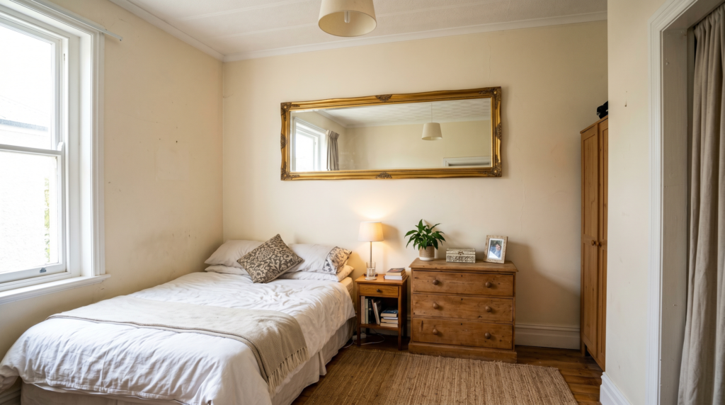
For more premium decor ideas, follow me on Pinterest.